♫ (![[personal profile]](https://www.dreamwidth.org/img/silk/identity/user.png) supernova) wrote in
supernova) wrote in ![[community profile]](https://www.dreamwidth.org/img/silk/identity/community.png) thenightvale2022-12-17 06:54 pm
thenightvale2022-12-17 06:54 pm
twenty-nine
10 x Cyberpunk: Edgerunners


For round 20 @somein30, extra hard mode.
Here is my path:
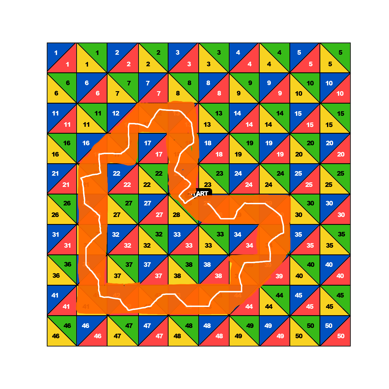
As you can see, I went for a very specific pattern lol
It gave me 41 themes, which neatly translated into 9 icons with 4 themes and 1 with 5. Which is about as many as I thought I would have the time/energy to make, so this worked out well!
I couldn't go to the yellow 41 field but I still included it because the heart wouldn't be complete without it ok. I had to.
Explanations and themes below:
1.
28 green - texture
23 red - FACADE
23 blue - palette
18 yellow - outline
Here I decided to take 'facade' pretty literally and used some buildings as a decoration. From the texture, I took the green parts, desaturated them and used to add some grit to the icon.
2.
18 green - texture
13 red - WINE
13 blue - palette
12 green - texture
Ok so, I know the palette is kind of... not obvious, but the darkest tone and the reds are colors from the icon with saturation bumped up, trust meeee. I just kind of. Couldn't figure out how to use this weird fleshy palette tbh. So I decided to use it barely
3.
12 yellow - thick bars
12 red - CHOOSE
17 green - texture
16 red - RETIRE
I got lucky with the word themes here, and made them work togethe - I used screencap from a moment where David is making the decision whether to go into the mercenary business or to leave it soo. It makes sense I think lol
4.
21 green - texture
21 yellow - stock
26 blue - palette
26 red - INJECT
Ok so. Another palette I didn't really enjoy but I used it on the stock flowers sooo hopefully that's enough! As for inject, I literally injected the flowers into the screencap.
5.
31 green - texture
31 yellow - no eyes
36 blue - texture
36 red - LAW
I think this one is pretty straightforward!
6.
41 green - texture
42 blue - palette
42 red - COMPETITION
42 yellow - extra matte
(41 yellow - background text)
Extra matte was kind of... difficult to interpret with anime screencaps, since it's already pretty matte by default? But I decided to make it even more flat and uncontrasted so hopefully that's enough. The competition here is between the two halves of the icon, which represent 2 very contrasting points of David's life and development.
The theme in brackets is unofficial because I couldn't legally go to that triangle, but... I wanted to include it anyway so. I do what I want.
7.
42 green - texture
43 blue - palette
43 red - SILK
43 yellow - gradient background
Another pretty straightforward one I think, I didn't have better ideas for 'silk' so I just googled a picture of silk fabric and used it in the background lol
8.
43 green - texture
44 blue - palette
39 yellow - tiny borders
39 green - texture
Pretty simple technical themes here, so I figured that since the icon would be quite easy to plan, I'd go with a relaxing scene too c:
9.
39 blue - palette
34 yellow - light blobs
34 green - texture
29 red - NIGHT
'Night' here is represented by the matrix text kinda looking like stars, maybe. And also, the anime takes place in Night City so technically any icon would fit the theme.........I'm sticking with that explanation lol
10.
29 blue - palette
29 green - texture
29 yellow - pain splatters
28 red - ATMOSPHERE
28 blue - palette
Had 5 themes left so this icon has an extra one! I was really glad the palettes actually worked together since they contain similar tones, so it was actually doable lol. 'Atmosphere' is represented by some spacey textures that kinda disappeared behind the paint splatters but they aRE THERE ok.
Anyway, this was fun and definitely a worthy last theme in this amazing comm ♥ I'll miss you guys!
For round 20 @
Here is my path:
As you can see, I went for a very specific pattern lol
It gave me 41 themes, which neatly translated into 9 icons with 4 themes and 1 with 5. Which is about as many as I thought I would have the time/energy to make, so this worked out well!
I couldn't go to the yellow 41 field but I still included it because the heart wouldn't be complete without it ok. I had to.
Explanations and themes below:
1.
28 green - texture
23 red - FACADE
23 blue - palette
18 yellow - outline
Here I decided to take 'facade' pretty literally and used some buildings as a decoration. From the texture, I took the green parts, desaturated them and used to add some grit to the icon.
2.
18 green - texture
13 red - WINE
13 blue - palette
12 green - texture
Ok so, I know the palette is kind of... not obvious, but the darkest tone and the reds are colors from the icon with saturation bumped up, trust meeee. I just kind of. Couldn't figure out how to use this weird fleshy palette tbh. So I decided to use it barely
3.
12 yellow - thick bars
12 red - CHOOSE
17 green - texture
16 red - RETIRE
I got lucky with the word themes here, and made them work togethe - I used screencap from a moment where David is making the decision whether to go into the mercenary business or to leave it soo. It makes sense I think lol
4.
21 green - texture
21 yellow - stock
26 blue - palette
26 red - INJECT
Ok so. Another palette I didn't really enjoy but I used it on the stock flowers sooo hopefully that's enough! As for inject, I literally injected the flowers into the screencap.
5.
31 green - texture
31 yellow - no eyes
36 blue - texture
36 red - LAW
I think this one is pretty straightforward!
6.
41 green - texture
42 blue - palette
42 red - COMPETITION
42 yellow - extra matte
(41 yellow - background text)
Extra matte was kind of... difficult to interpret with anime screencaps, since it's already pretty matte by default? But I decided to make it even more flat and uncontrasted so hopefully that's enough. The competition here is between the two halves of the icon, which represent 2 very contrasting points of David's life and development.
The theme in brackets is unofficial because I couldn't legally go to that triangle, but... I wanted to include it anyway so. I do what I want.
7.
42 green - texture
43 blue - palette
43 red - SILK
43 yellow - gradient background
Another pretty straightforward one I think, I didn't have better ideas for 'silk' so I just googled a picture of silk fabric and used it in the background lol
8.
43 green - texture
44 blue - palette
39 yellow - tiny borders
39 green - texture
Pretty simple technical themes here, so I figured that since the icon would be quite easy to plan, I'd go with a relaxing scene too c:
9.
39 blue - palette
34 yellow - light blobs
34 green - texture
29 red - NIGHT
'Night' here is represented by the matrix text kinda looking like stars, maybe. And also, the anime takes place in Night City so technically any icon would fit the theme.........I'm sticking with that explanation lol
10.
29 blue - palette
29 green - texture
29 yellow - pain splatters
28 red - ATMOSPHERE
28 blue - palette
Had 5 themes left so this icon has an extra one! I was really glad the palettes actually worked together since they contain similar tones, so it was actually doable lol. 'Atmosphere' is represented by some spacey textures that kinda disappeared behind the paint splatters but they aRE THERE ok.
Anyway, this was fun and definitely a worthy last theme in this amazing comm ♥ I'll miss you guys!